


PHOENiX Sample · 4 min read · Last updated
A folder of attractive images is a starting point for a color collection, not the finished research. Trend imagery can reveal recurring directions, but a usable palette must work as a system: broad field colors need supporting tones, accents need context and neighboring shades must offer meaningful choices. The transition from inspiration to collection is an act of selection and testing.
A strong collection explains why its colors belong together and how a designer can use them. It does not depend on declaring every shade a future bestseller.
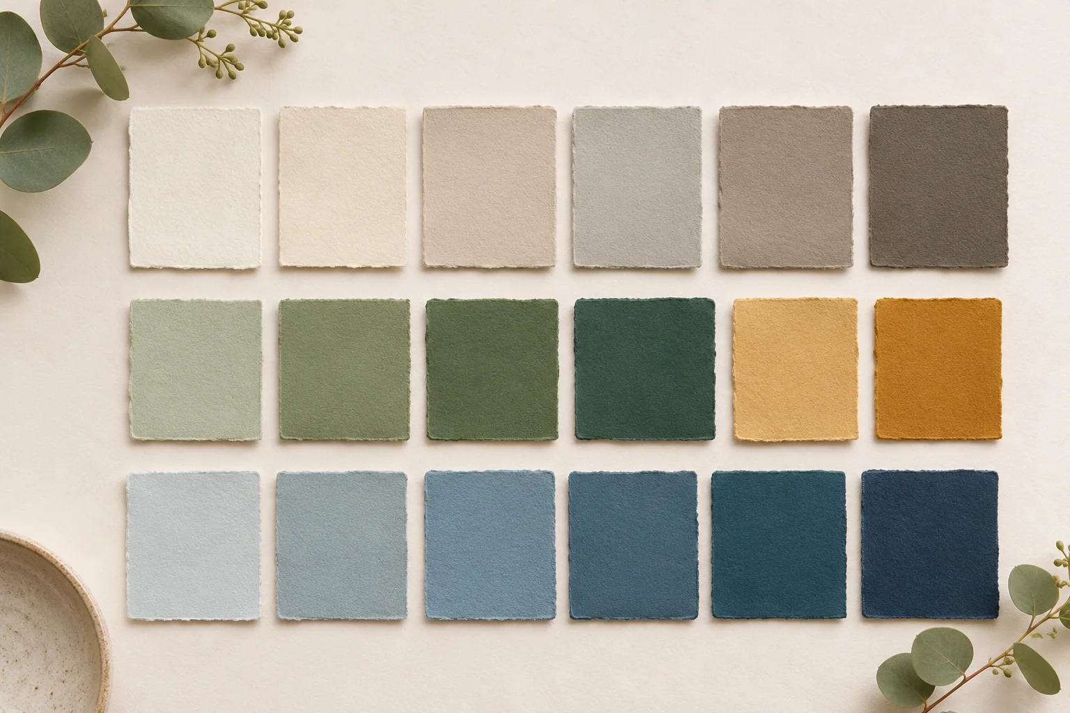
AI-generated concept illustration: A curated physical palette of base colors, middle tones and accents.
Distinguish signals from evidence of demand
Editorial imagery, exhibitions, material launches and architectural projects can indicate emerging visual themes. They do not automatically prove purchasing demand in a specific market. Keep the source and its relevance visible in the research notes.
Group observations by the idea they suggest rather than copying isolated colors from photographs. A recurring interest in mineral surfaces might lead to a study of muted warmth, texture and restrained contrast. That is a design direction to investigate, not a claim that one precise photographed shade must enter the range.
RAL’s 2026+ report illustrates a documented approach: its palette draws on social, technological, economic and design observations and can be adapted to individual projects. This is a forecasting method, not proof of local sales demand. [2]
Assign roles before increasing the count
Decide what the collection needs to accomplish. Identify adaptable base colors, middle tones that connect schemes and accents that create emphasis. A collection with many visually similar shades may look sophisticated in a grid yet be difficult to navigate in practice.
Evaluate the distance between neighboring choices. If two candidates serve the same role and offer little useful distinction, consider whether both are needed. Conversely, a missing intermediate tone can make an otherwise attractive palette difficult to combine. Editing is part of the technical usefulness of the collection.
Test relationships in physical form
In Interaction of Color, Josef Albers uses visual studies to show how a color can look different against different backgrounds. For collection development, the practical implication is to examine combinations rather than only individual chips. Review the palette in the intended finishes and beside representative materials. [1]
Build several schemes with different proportions. A strong accent in a small area may be convincing while the same color used as the dominant field feels unsuitable for the intended application. Record the role that made the combination work instead of presenting every shade as interchangeable.
Connect the story to the specification
A poetic collection title can help organize the narrative, but each color still needs an identifier and an approved reference. Keep the visual story separate from technical records while maintaining a clear link between them. A change made during physical development should be reflected in the final palette and its digital representations.
An illustrative review might reveal that a photographed clay tone becomes too saturated when applied over a large panel. The responsible response is to refine the physical candidate and describe the adjustment, not preserve an unsuitable value merely because it matched an inspiration image.
Publish a collection that can be navigated
Explain the principal relationships, suggest a few credible combinations and show where the accents belong. Avoid presenting a long list of unsupported psychological promises. The reader should be able to identify a starting point and understand how the palette develops from it.
Trial an accent before adding it to the range
If a trend study highlights terracotta, test a painted chip beside the proposed base and supporting colors. Compare a small accent use with a larger area in a representative material board. Check whether the intended finish can be supplied and whether the color duplicates an existing shade. Assign it a role and a code before preparing the production brief. [1]
Practical conclusion
After release, keep feedback connected to actual use: which combinations are explored, where selection becomes difficult and which shades fill a practical need. This closes the loop between research and application and gives the next collection a stronger foundation than visual novelty alone.