


PHOENiX Sample · 3 min read · Last updated
A paint chip is deliberately isolated so that a shade can be identified and compared. A finished interior is not isolated: walls meet floors, shadows cross surfaces and colors appear in unequal proportions. Moving from the chip to the room changes the viewing task. The designer is no longer judging only a sample but a composition of relationships.
Recognizing that change helps explain why a technically accurate chip can still lead to an unsatisfactory scheme. Accuracy of reproduction and suitability of design are separate questions.
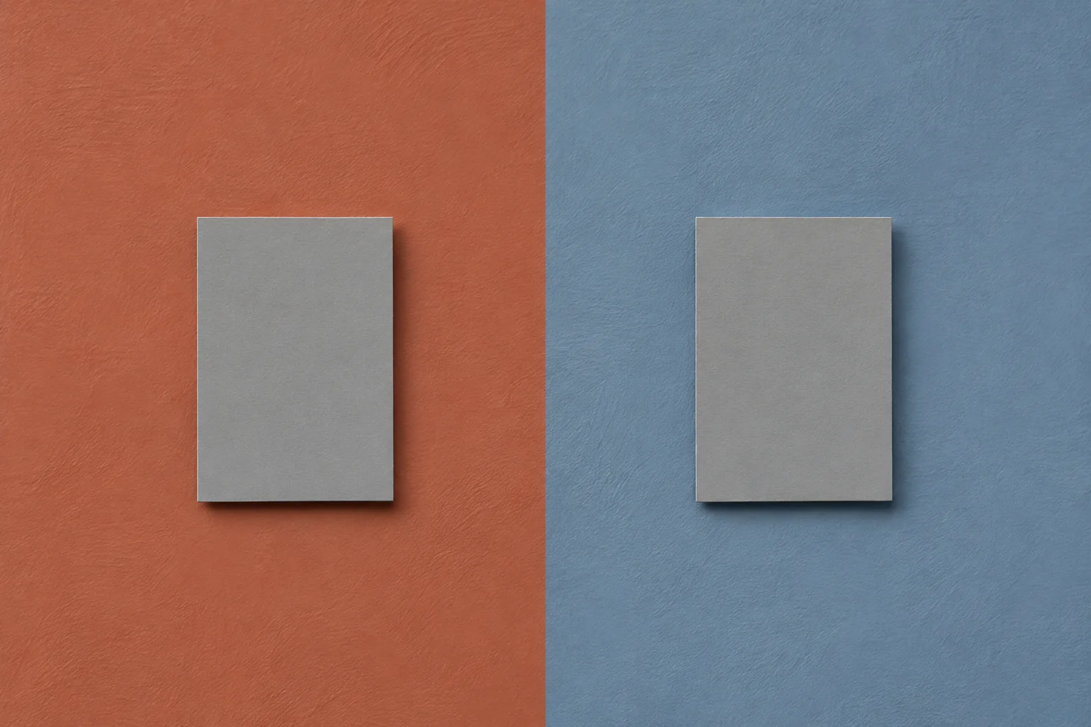
AI-generated concept illustration: Gray samples presented against warm and cool backgrounds.
Identify the relationship being evaluated
A color may be expected to blend with a material, distinguish one surface from another or act as a focal point. These roles lead to different tests. A close match requires careful side-by-side comparison, while a deliberate contrast needs enough separation to remain legible in the intended setting.
Write the intended role before adjusting the palette. Otherwise, a review can drift between contradictory aims: one person asks for a quieter relationship while another expects stronger emphasis. The disagreement may concern design intent rather than the sample itself.
Compare adjacency and proportion
Place the selected colors and materials in the relationships they will actually have. A small accent surrounded by a large neutral field is different from equal-sized chips arranged in a row. Use a material board or simple mock-up to approximate the proportions that matter.
The CIE identifies the surrounding area as one factor that affects how a color is perceived. The practical response is not to abandon color specifications, but to test them in context. Keep the physical references stable while changing the composition so that the effect of the relationship can be discussed clearly. [1]
Keep material character in the study
A flat painted card cannot fully represent translucent stone, polished metal or a strongly textured plaster. Surface character changes the way light is reflected and the way an area attracts attention. Include actual material samples when they influence the design decision.
An illustrative scheme might use a muted blue wall beside warm wood. If the combination appears too stark, changing the blue is only one option. The proportion, finish, intervening trim or lighting may also influence the relationship. Explore the design variables deliberately rather than treating the paint formula as the only adjustable component.
Use digital studies for the right task
Digital visualizations are valuable for composition, zoning and comparing broad alternatives. Their usefulness does not make them physical approval standards. The ICC explains that display consistency depends on calibration and profiling, and display reproduction still operates within device limitations. [2]
Keep the visualization linked to named physical references. Use it to decide which relationships deserve a mock-up, then evaluate the selected materials under relevant conditions. This avoids asking one screen image to prove color, gloss, texture and spatial performance simultaneously.
Record the design decision separately from production approval
Once a scheme is selected, document the actual surfaces, finishes and references. The production team needs stable targets; the design team needs a record of why those targets were chosen. Combining those records without distinguishing their purpose can obscure responsibility when a later change occurs.
Swap the surroundings and observe the same chip
Place one painted chip beside warm wood and then beside a cool gray tile under the same light. Keep the viewing angle and visible chip area fixed. Note how the apparent warmth changes. Then assemble a larger panel with the actual materials in their intended proportions and record the context used to select the color. [1]
Practical conclusion
A well-used swatch is a starting point and an identification tool. Its limitations become manageable when the workflow adds context at the right stage. The resulting decision is more robust because the shade has been considered as part of a material composition rather than as an attractive rectangle on its own.