


Botanical architecture
Let a light foundation meet nuanced foliage and a rich green focal point.

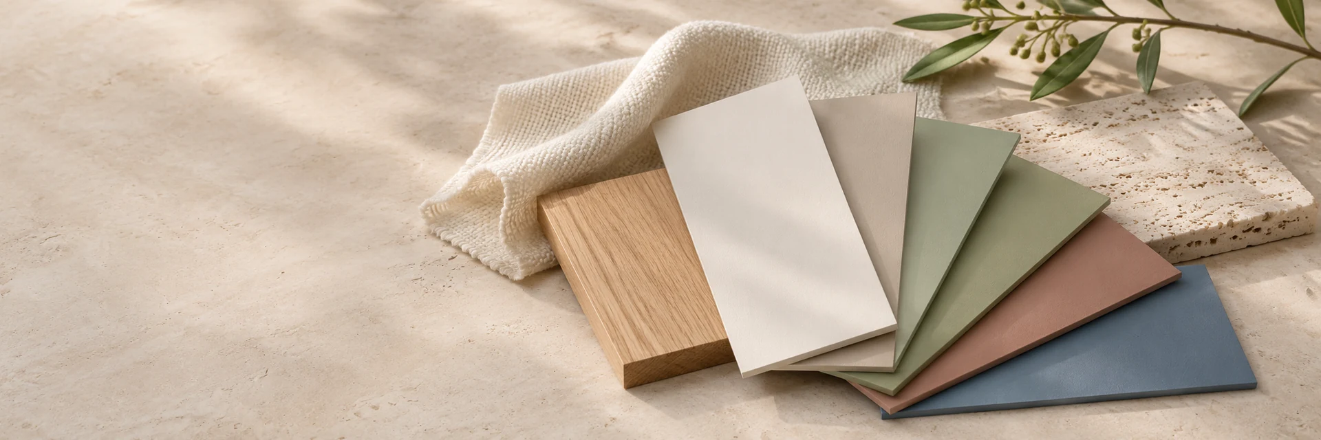
Color Trends 2027 explores material-led warmth, botanical complexity and stronger coastal and mineral accents.
THE ANNUAL COLOR EDITION
Explore luminous neutrals alongside expressive greens, coastal blues and earth-derived warmth. The 2027 edition offers both restraint and confident contrast.
THE 2027 COLOR COLLECTION
Explore all 26 colors across five complementary families. Open any shade to learn about pairing possibilities, materials and lighting considerations before making a physical sample decision.
START WITH THE COLLECTION
A starting point for exploring the collection—not a ranking. Discover each color’s individual character and possible applications.
Luminous architectural neutrals moving from pearled white into warm mineral sand.
Sun-faded rose and nuanced lilac, balanced by a restrained mineral undertone.
Botanical greens that connect silvery foliage to grounded forest depth.
Coastal blue-greys and mineral teal, from misty light to deep ink.
Warm clay, softened ochres and shadowed woods for confident architectural accents.
COLOR PAIRING INSPIRATION
Three illustrative combinations drawn from this collection. Open individual colors to explore the shade in more detail; confirm final choices with physical samples under intended lighting.
Let a light foundation meet nuanced foliage and a rich green focal point.
Bring together warm light, misty blue and a strong mineral teal.
Combine a gentle cream, clay-inspired color and darker wood-toned depth.
PHOENiX COLOR RESEARCH
Our annual color collections connect professional paint-industry experience with design direction, customer insight and the practical realities of color selection.
PHOENiX Sample draws on years of technical expertise and experience serving major paint manufacturers and diverse clients across international markets. Market observations, input from tinting centers, patterns of color demand and evolving preferences help inform the selection process, alongside the study of design and architectural trends.
Our objective is to develop balanced palettes that make sense as complete color collections, not isolated fashionable shades. Each direction is assessed for usefulness, combination potential and its role in a broader visual story.