


PHOENiX Sample · 4 min read · Last updated
A color name helps a person remember a shade, but it does not define the shade with technical precision. Names draw on objects, places, materials and experiences, and those associations do not travel unchanged between languages. A collection intended for several markets therefore needs two connected systems: an expressive naming layer and a stable identification layer.
Confusing those roles can create avoidable problems. A translated name may sound elegant while pointing toward a different expectation, and an order based only on a familiar word can identify the wrong sample.
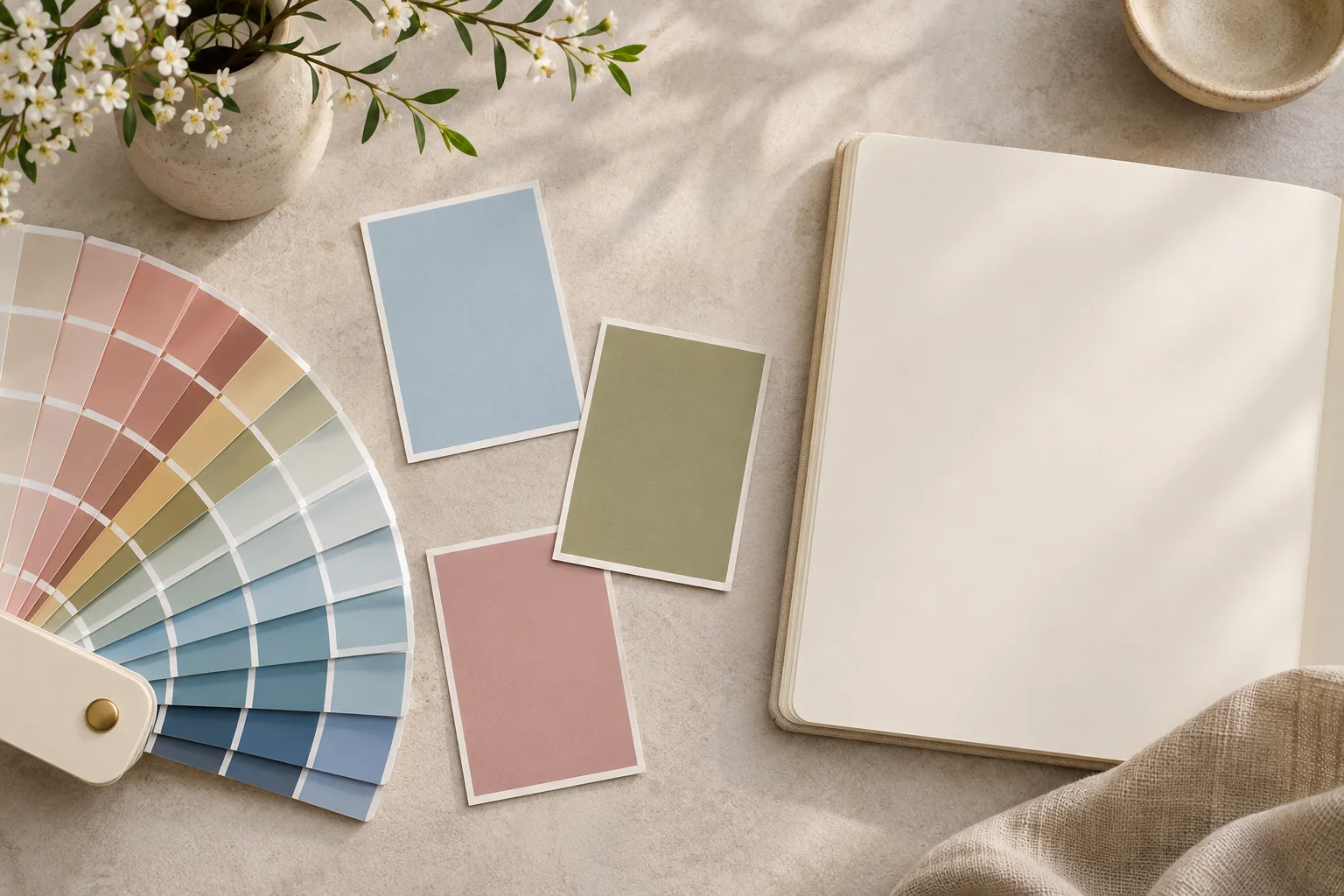
AI-generated concept illustration: Color chips, a fan deck and an unmarked notebook.
Separate the name from the identifier
Give each shade a stable code that remains attached to the approved reference. The public name can be translated or adapted while the code preserves continuity across artwork, orders, sample libraries and digital listings. Do not recycle an identifier casually when a shade changes: a familiar code with a new appearance can be more misleading than a new name.
Keep a controlled record of the original name, approved local names, code, reference revision and status. This is particularly valuable when a collection has regional editions or when a shade is renamed without being reformulated.
Understand why literal translation is insufficient
Research on color naming shows that languages do not divide and describe the color domain in identical ways. The PNAS study “What we talk about when we talk about colors” examines how communicative needs relate to these differences. It does not provide a ready-made naming formula for a paint collection, but it supports caution about assuming one-to-one equivalence. [1]
Review proposed names with fluent local readers who understand the intended audience. Ask what the words suggest, whether they are natural in a product context and whether the combination creates an unintended association. A dictionary check alone cannot answer those questions.
Keep evocative language distinct from product claims
A name that suggests mineral, silk or limestone should not automatically imply that the coating contains those materials. Similarly, words associated with calmness or energy should not be turned into unsupported promises about how every person will feel in a room.
The editorial description can explain the visual character more directly: a low-chroma blue-green, a warm off-white or a deep muted red. Such descriptions help users understand the collection without pretending that evocative names replace physical assessment.
Test names in the full presentation
Review the name on the actual chip, in a fan deck, on a retail display and in the ordering interface. Check line breaks, diacritics, character support and the possibility of confusion between similar names. A long phrase that works in a catalog paragraph may become unreadable beneath a small sample.
An illustrative naming test might reveal that two distinct shades translate into nearly identical expressions. Preserve their separate identifiers and revise the naming approach before artwork release. Do not rely on users to notice a small visual difference every time they reorder.
Maintain continuity as the collection evolves
Record retired names as searchable aliases where appropriate, while keeping one approved current name per edition. Explain substantial changes rather than silently replacing the reference. The naming system should support both inspiration and accurate retrieval.
Test a translated name on the finished card
Present the same chip and permanent code with two candidate names to native readers. Ask what hue, finish and material each name suggests before showing the chip. If readers expect metallic paint from a name for a matte gray, revise the name and keep the code. Record the approved name for each locale. Research on color naming across languages
Practical conclusion
A successful name invites attention; a disciplined identification system prevents ambiguity. Keeping both roles visible lets a collection feel culturally natural without sacrificing the technical reliability that designers, retailers and production teams need.