

PHOENiX Sample · 4 min read · Last updated
A fan deck and a color chart can contain the same collection while helping users make different decisions. The fan deck allows pages to be moved, isolated and carried. A chart offers an overview and can show relationships within a fixed layout. Choosing between them is therefore a design problem about use, not a contest to identify one universally superior format.
The best starting point is the customer's task: browsing a range, comparing adjacent shades, presenting a shortlist or returning to a known reference.
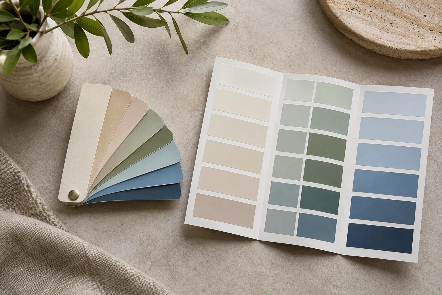
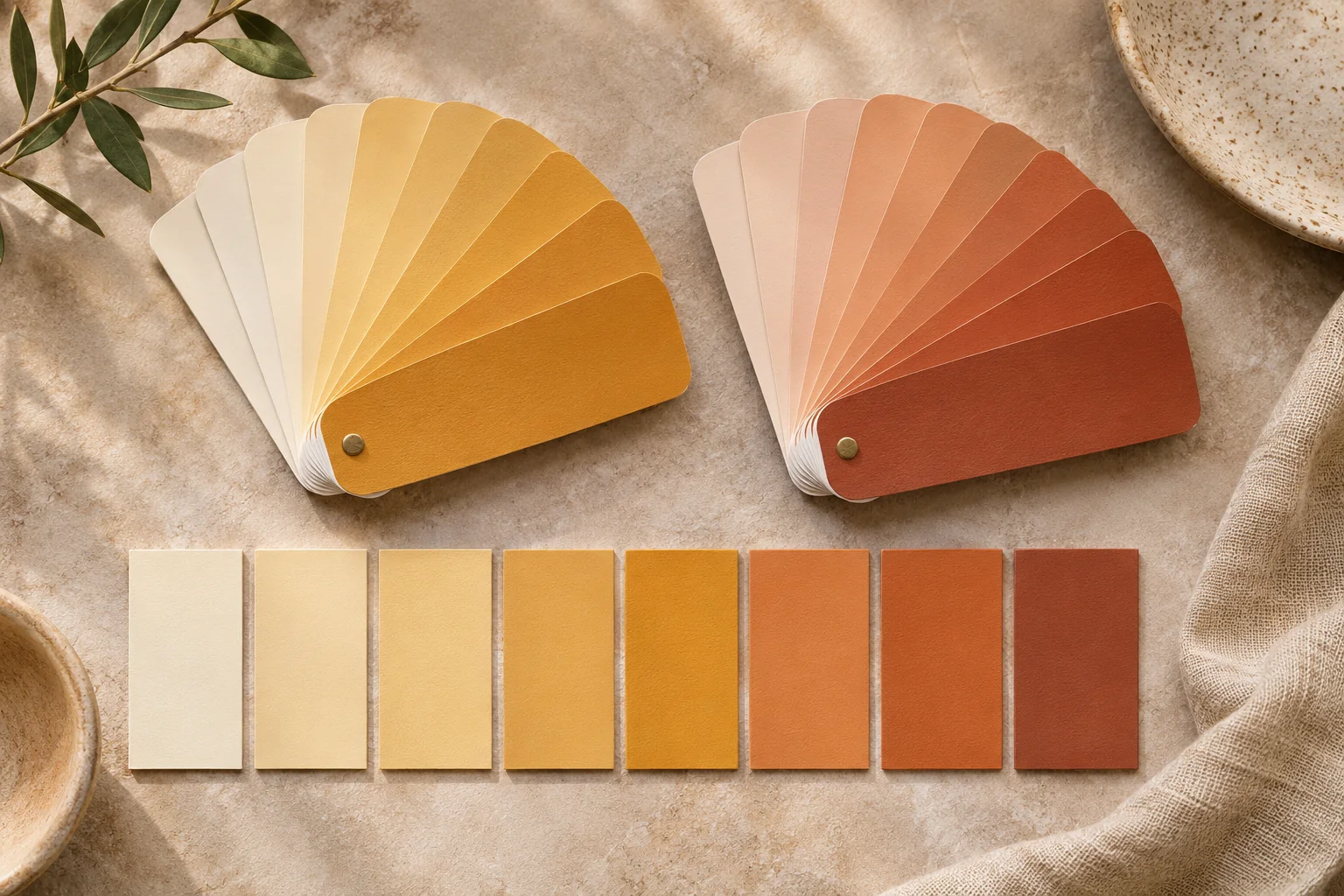
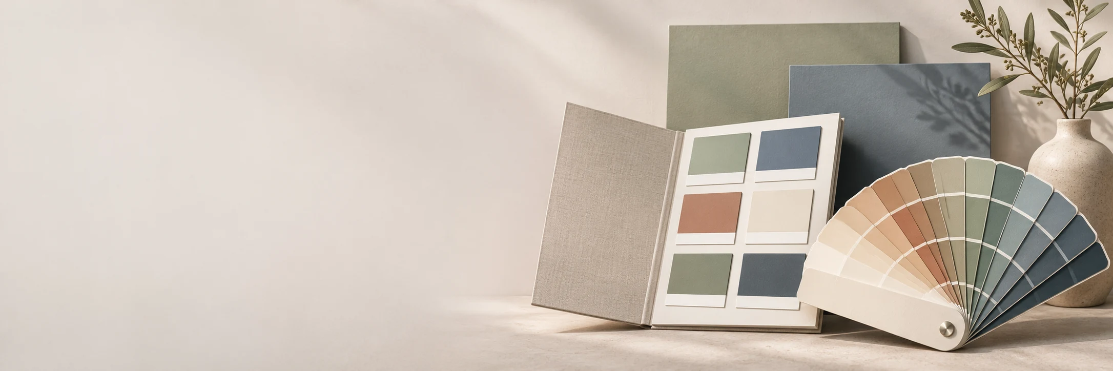
AI-generated concept illustration: A portable fan deck beside an open flat color chart.
Match the format to the viewing task
A fan deck is useful when users need to isolate a page, place a sample near a material or navigate a large portable collection. Its sequence and indexing become important because much of the range is hidden until the pages are moved.
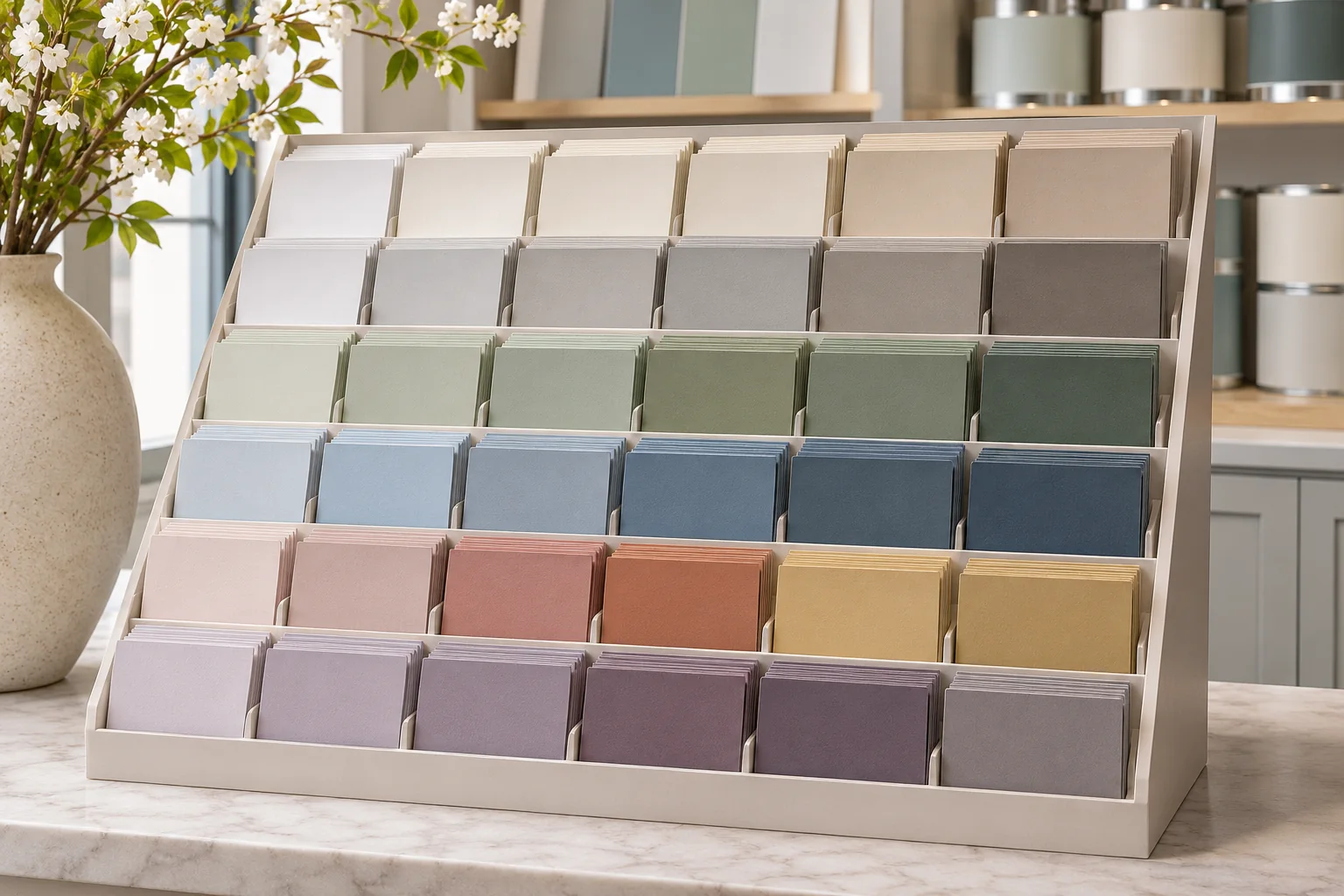
A chart can expose several families at once. This makes it useful for an overview, a curated palette or a discussion in which relationships should remain visible. Its fixed arrangement also imposes limits: sample area, folding and the number of shades must work within the available space.
Compare custom color fan deck formats and coated color chart formats to see how PHOENiX presents each format.
Consider sample area and context together
A larger color area can support closer visual assessment, but it does not automatically make a format more effective. The sample must still be easy to identify, handle and compare. A large full-page leaf and a stripe-coated page serve different browsing needs.
Evaluate a physical prototype with representative colors. Near-neutrals reveal whether neighboring samples are easy to distinguish; dark shades test label visibility and handling; a mix of hues shows whether the organization remains intuitive. A blank construction mock-up cannot answer all of these questions.
Compare the operational consequences
| Design consideration | Fan deck | Color chart |
|---|---|---|
| Collection overview | Revealed through page movement | Often visible across one spread |
| Isolating a shade | Individual leaves can be positioned | Depends on folds or detachable elements |
| Navigation | Sequence, tabs and codes matter | Grouping and spatial hierarchy matter |
| Updating | Binding and replacement policy matter | Reprinting or modular construction may be needed |
| Storage and handling | Thickness and pivot behavior matter | Fold durability and flatness matter |
These are design tendencies rather than fixed rules. A custom format can combine features, but added complexity should solve a real use problem rather than simply make the object more elaborate.
Prototype the journey, not only the object
Ask a user to locate a named shade, compare it with a neighboring option and return to it after viewing another family. Observe hesitation, misreading and awkward handling. A visually impressive format may fail if codes are hidden near the pivot or folds make a sample difficult to place against a surface.
For identification, do not rely on color alone. W3C's use-of-color guidance applies to digital content, but its principle offers a useful design consideration for physical systems: reinforce distinctions with readable codes and labels. This is an application of the principle, not a claim that a printed deck has been certified against a web standard. [1]
Nielsen Norman Group recommends realistic tasks that require action without revealing the steps. Apply that testing approach here to finding and comparing physical samples, observing the user’s choices without coaching. [2]
Choose the format as part of a sample system
Many programs benefit from complementary formats: an overview chart for discovery, a fan deck for detailed navigation and larger samples for final assessment. Define the role of each so that identifiers and references remain consistent.
Test the format with a real selection task
Give participants both formats with the same painted shades and codes. Ask them to find a specified shade, compare it with its neighbour and read back the code. Alternate which format they use first. Record time, wrong selections and whether they need a free hand or a table. Repeat in the intended work setting before choosing the format. Nielsen Norman Group — Task scenarios for usability testing
Practical conclusion
The final choice should follow observed use, physical testing and a realistic update strategy. A successful format reduces the effort required to make the intended decision while preserving reliable identification of the selected color.