


PHOENiX Sample · 3 min read · Last updated
A physically accurate sample can still fail as a reference if its printed code is wrong. The risk increases when a collection contains many similar names, several languages or late revisions. Artwork control is therefore part of color communication, not merely the final cosmetic step before printing.
The objective is to keep every sample connected to the correct identity throughout design, proofing, production and future reorders.
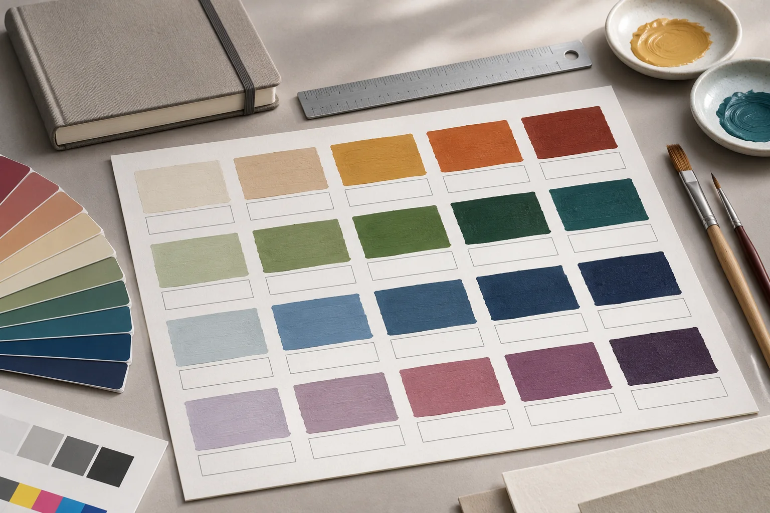
AI-generated concept illustration: A color-chart layout with clear spaces for sample identifiers.
Establish one controlled color register
Create a master register containing the stable code, approved name, reference revision and intended position in the collection. Add language variants and product information only where they are required. Avoid maintaining competing versions in email attachments and separate design files without a clear authority.
Treat the register as structured data. Similar-looking codes should remain distinguishable, and retired identifiers should not be reused casually. If a name changes while the shade remains the same, record the relationship so that earlier orders and samples can still be interpreted.
Separate color approval from text approval
A screen proof can verify layout, spelling, order and information hierarchy. It does not, by itself, approve the appearance of a physical paint sample. The ICC's display guidance explains the role of calibration and profiling in digital consistency; that does not remove the material differences between an image and a coating. [1]
Use distinct approval records for artwork and physical appearance. The records can be coordinated in one workflow, but their purpose should remain visible. A signature on a PDF should not silently authorize an unreviewed change to the coating or sample construction.
Design labels for real handling
Codes and names need to remain readable when a deck is opened, a chart is folded or a chip is removed from a display. Check size, contrast and placement on a physical prototype. Keep essential identifiers away from binding areas, cut lines and positions likely to be obscured.
Proof with realistic content, including long names, diacritics and easily confused characters. A layout that works with short placeholders can break when the final data are inserted. Review the relationship between the label and its own sample so that a reader cannot reasonably associate it with the neighboring shade.
Use a two-direction verification
| Check | Method |
|---|---|
| Register to artwork | Confirm every required code appears in the correct position |
| Artwork to register | Confirm every printed entry belongs to the approved collection |
| Sample to label | Confirm the physical shade carries the intended identity |
| Revision to release | Confirm the production file is the approved version |
This prevents both omissions and unintended additions. Automated comparisons can help with large collections, but a representative physical proof remains important for reading order, trimming and handling.
Close revisions cleanly
When a late change is approved, identify every affected item: artwork, register, digital listing, replacement chip or packaging. Withdraw superseded production files from active use and preserve them as history rather than leaving them beside the current release without status.
Adobe documents PDF comparison tools that report text and graphic changes between versions. Use such a report to support revision checking; physical shade approval still requires the agreed sample comparison. [2]
Check the exported artwork against the register
In a hypothetical fan deck, the approved register assigns code S-024 to leaf 12, but the exported proof shows S-042. Flag the mismatch before release. Compare the old and new PDFs to locate changes, then check the revised proof against the register and the labelled physical chip. Record the proof version and who approved the correction. Adobe — Compare PDF documents
Practical conclusion
A dependable sample system needs both visual accuracy and reliable identity. Artwork discipline protects the connection between them, so the shade a customer selects is the one that purchasing, production and quality control understand.