

PHOENiX Sample · 4 min read · Last updated 13 November 2026
A paint sample can belong to the same color family as another yet look more muted or more vivid. Calling one sample stronger is useful conversationally, but a production brief needs a more precise question: has its chroma changed, its lightness changed, or its hue shifted? This article isolates chroma so that the answer can be checked.
Chroma and saturation are different attributes
CIE distinguishes saturation, judged relative to the area's own brightness, from chroma, judged relative to a similarly illuminated neutral reference. Everyday language often mixes them. Here, C* means CIELAB metric chroma, an approximate numerical correlate of perceived chroma; it is not a saturation percentage. [1] [2]
Read C* as a distance, h as a direction
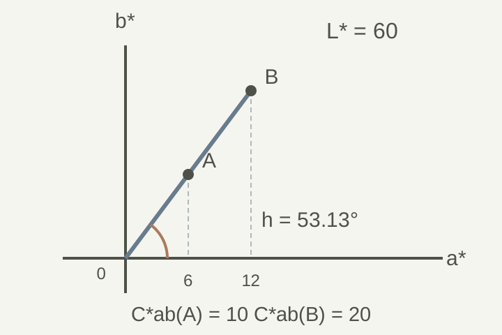
At a fixed L*, the a* and b* coordinates locate the sample in a plane. C*ab is its radial distance from the neutral axis. The hue angle hab describes the direction from the positive a* axis. Thus changing C* while retaining L* and h moves along one ray rather than toward a different hue. Use the full label C*ab when confusion with another color space is possible. [3]
Calculate C*ab = √(a*² + b*²). For the hue angle, use atan2(b*, a*) and express the result in degrees from 0° to less than 360°; a simple one-argument arctangent needs quadrant correction. C*ab has no universal maximum of 100. [3]
A worked example at constant lightness
Consider two hypothetical coordinates at L* = 60. Sample A has a* = 6 and b* = 8; sample B has a* = 12 and b* = 16. Their chromas are 10 and 20, and both hue angles are approximately 53.13°. B has twice A's numerical C*ab, not a proven doubling of perceived vividness, pigment concentration or tinting strength. The example describes coordinates; it is not a coating recipe or a manufacturing tolerance.
| Sample | L* | a* | b* | C*ab | hab (°) |
|---|---|---|---|---|---|
| A | 60 | 6 | 8 | 10 | 53.13 |
| B | 60 | 12 | 16 | 20 | 53.13 |
Why hue becomes unstable near neutral
At a* = b* = 0, C*ab is zero and the hue angle has no unique meaning. Close to that point, small coordinate changes can create large angular changes. For example, (0.1, 0.1) and (−0.1, 0.1) both have C*ab ≈ 0.141, but angles of 45° and 135°. Investigate the coordinates and measurement stability before describing this as a major visible hue change. This conclusion follows from the coordinate geometry, not from a visual experiment.
Use chroma to write a clearer sample brief
When requesting a more muted version, identify the approved physical sample and ask for lower C*ab while retaining the intended L* and hue as closely as the material permits. Record what was actually achieved in all three coordinates. Review the resulting specimens together before approval. This separates a request for reduced chroma from a request for a lighter pastel or a different color family; those are different design decisions.
What the number cannot tell you
C*ab alone does not identify a color: many lightness levels and hue directions can share the same chroma. It also does not specify pigment dosage or guarantee that a requested coordinate is achievable with the chosen coating and substrate. For sample development, treat a chroma target as one part of a physical specification, with material feasibility and visual approval still to be established.
Practical conclusion
Use C*ab to describe how far a sample lies from the neutral axis in CIELAB, while retaining L* and hue information. Specify the intended change, check the physical specimens and record the resulting coordinates. Avoid treating chroma as a saturation percentage, a pigment recipe or a complete appearance judgment.