

PHOENiX Sample · 4 min read · Last updated
Neutrals are often chosen to simplify a space, yet they can be among the most demanding colors to select. A pale gray that appears balanced on a small card may look warmer beside stone or cooler next to timber. The issue is not that the color has become unreliable. It is that its appearance is being judged within a different relationship.
An effective neutral palette is therefore built through comparison. It should be examined with the materials, lighting and scale that give the subtle differences meaning.
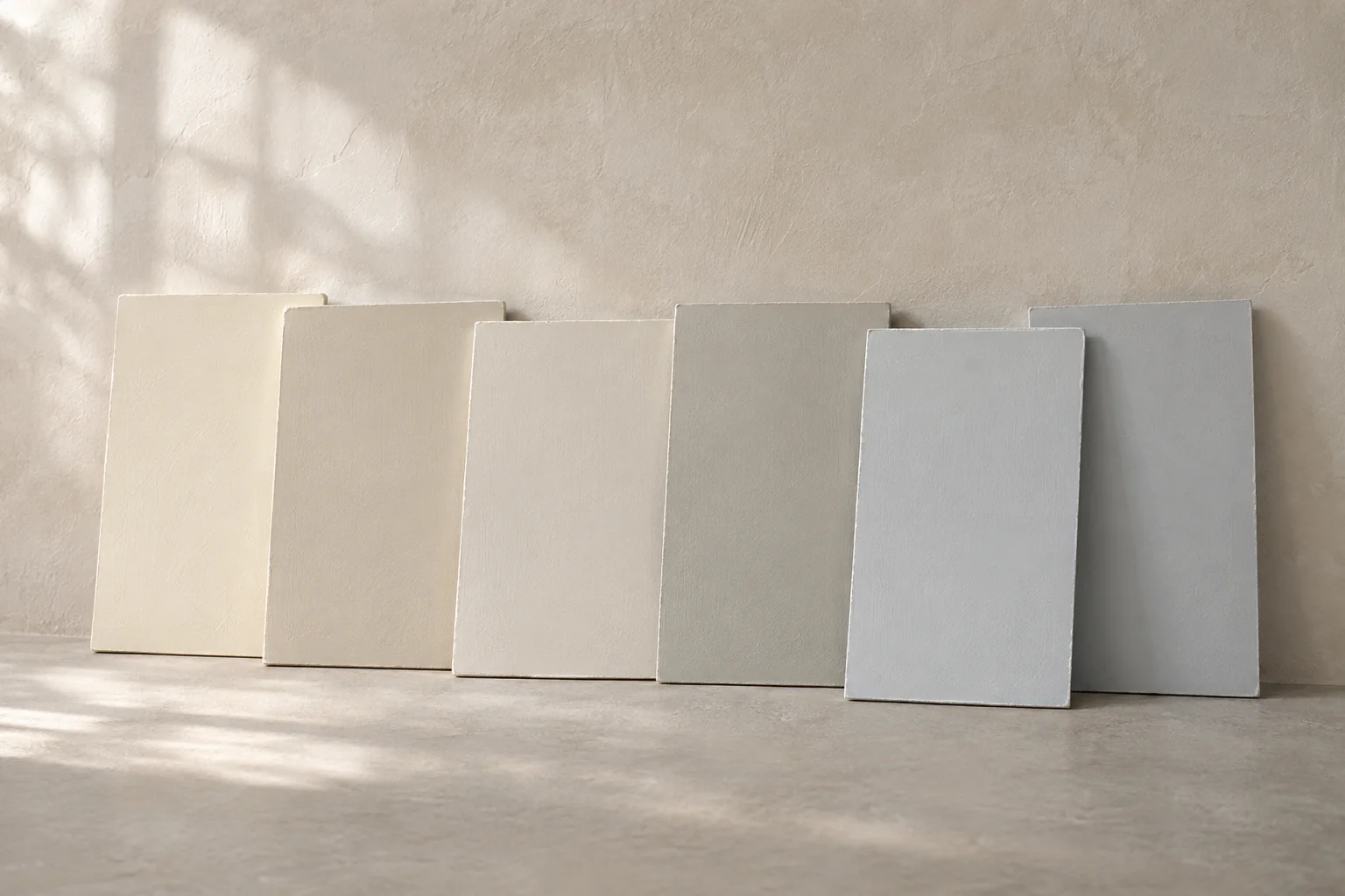
AI-generated concept illustration: Warm and cool neutral painted panels in daylight.
Use undertone as a comparative description
In design conversation, undertone is a useful way to describe a neutral's tendency relative to another reference. It is not a substitute for a complete color specification. A chip described as warm may appear less warm when placed beside a stronger yellow-beige, while a nearly neutral gray may reveal a greenish tendency beside a pink material.
Compare candidates together and keep their identifiers visible. Avoid relying on memory after moving between rooms or screens. The aim is to establish relationships that can be checked again, not to assign every neutral a permanent emotional or stylistic label.
Begin with the materials that will remain
Fixed elements often have more influence on the scheme than the paint selection: flooring, stone, joinery or an existing finish. Place physical paint samples beside these materials and consider both broad areas and connecting details. A neutral may coordinate with one element while creating an unintended contrast with another.
Decide which relationship is most important. A wall color does not need to imitate every material in the room. It may serve as a quiet background, connect two surfaces or create deliberate separation. Naming that role makes the selection more disciplined.
Review the light without chasing every variation
Observe candidates under the relevant lighting conditions, including the intended artificial lighting where available. Keep the same samples and placement when comparing conditions. A single photograph is a weak basis for distinguishing close neutrals because capture and display settings introduce additional changes.
Controlled review helps identify the color relationship, while a site sample tests its behavior in the space. These are complementary stages. Do not keep changing the candidate in response to every temporary shadow or isolated phone image without deciding which conditions matter to the project.
Move beyond the small chip
A larger sample provides more useful evidence about a broad wall field and its relationship to adjacent surfaces. Apply or position it in representative locations and in the intended finish. Examine it at a normal viewing distance rather than only from a few centimeters away.
The CIE defines lightness relative to an apparently white reference under similar illumination. In practice, two neutrals should be compared for both their chromatic tendency and the contrast they create. Similar hue character does not guarantee the desired separation between wall, door and trim. [1]
Narrow the selection with a recorded rationale
Keep a short candidate list and note why each option remains. For example: one supports the warm stone, another separates the joinery more clearly, and a third works under the installed lighting but clashes with the floor. These observations make the final choice explainable.
Compare two near-neutrals against a fixed material
Set two near-neutral chips beside the permanent flooring. Compare chips of similar lightness and the intended finish. Under one light, compare each chip separately with the floor, then place both side by side. Repeat under the main evening light and note whether either reads pink, green or yellow relative to the floor. Retain the chosen chip and the two viewing conditions. [1]
Practical conclusion
A useful neutral is not necessarily the most visually absent shade. It is the one that performs the intended role consistently enough across the project. That decision is stronger when it is grounded in physical relationships rather than a fashionable name or an isolated screen swatch.