


01
Living
Try Soft Meringue on a sizeable painted panel in the living, with cotton muslin nearby. Compare it against honey oak before deciding whether it works as the main wall color or a smaller accent.
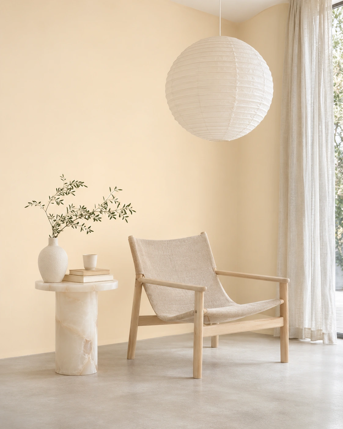
A gentle golden glow, barely above white.
A buttery near-white with an understated golden glow.
Soft Meringue belongs to the Airy Lights & Soft Neutrals palette. A buttery near-white with an understated golden glow. Its most useful design quality is its soft yellow note against ceiling white; compare it with honey oak and cotton muslin before building the rest of the scheme.
For a compact dining space, introduce oyster white as a quieter companion and use olive for a measured point of contrast. The aim is to test these relationships, not to treat a screen color as a paint specification.
Three ways to explore Soft Meringue in a real interior. Every suggestion should be checked against the room's actual light and materials.
Try Soft Meringue on a sizeable painted panel in the living, with cotton muslin nearby. Compare it against honey oak before deciding whether it works as the main wall color or a smaller accent.
Use oyster white on the connecting surfaces so Soft Meringue has room to register. In a dining, test the meeting point with doors, ceiling paint and the principal flooring before finalizing the palette.
Bring in olive through one movable object or fabric rather than committing every surface to contrast. Check Soft Meringue in the kitchen under the actual lamps and available daylight.
Explore these three actual color directions from the 2027 collection. The visual relationships are editorial suggestions; compare real samples before choosing a scheme.
Assess Soft Meringue on two walls that receive different light. Its defining variable is its soft yellow note against ceiling white: compare the fully dried color near the window and deeper inside the room, then repeat after the evening lights are switched on. The neighboring honey oak and oyster white may change how its undertone appears.
A low-sheen finish can make Soft Meringue feel visually quieter beside cotton muslin, but a satin coating may be more suitable where cleaning is frequent. Test the selected manufacturer’s product on the actual substrate: sheen, texture and film build can affect the appearance, and the right specification depends on the room’s use.
Paint a sufficiently large sample of Soft Meringue, allow it to dry according to the product instructions, and compare it directly with honey oak, cotton muslin and oyster white. Review the result in daylight and artificial light. A printed, real-paint fan deck or color chart is useful for comparing options, but the final on-site painted sample remains essential.
PHOENiX Sample researches color directions and manufactures custom real-paint fan decks and color charts for paint and coatings manufacturers.
Explore how Soft Meringue interacts with daylight, surrounding materials and coating sheen, then use a physical paint sample to verify the choice in its intended space.
A gentle golden glow, barely above white. In practical terms, Soft Meringue can connect cotton muslin with honey oak without requiring every finish in the room to match. Its visual identity depends particularly on its soft yellow note against ceiling white.
For a compact dining space, begin with Soft Meringue as the color under consideration, place oyster white beside it, and introduce olive in a limited accent. Photograph the test surfaces only as a record of the arrangement: make the final judgment in person, where material texture and reflected light are visible.
When evaluating Soft Meringue, pay close attention to its soft yellow note against ceiling white. Observe a dried test area beside honey oak in morning and late-day light; the same wall can change in apparent depth and undertone when the main source of illumination changes.
Choose matte, eggshell or satin for the coating’s service requirements rather than on appearance alone. Beside cotton muslin, a lower sheen may soften reflections; on a frequently handled surface, the paint manufacturer’s cleaning and durability guidance takes priority. Test the chosen sheen rather than assuming the digital image predicts it.
Soft Meringue is an editorial color direction in the 2027 PHOENiX collection. This reference is not a paint formulation or an instrument-certified match. Compare a fully cured sample at the scale, lighting and sheen intended for the project.
For brands developing customer-facing color collections, PHOENiX Sample can manufacture custom fan decks and color charts with real applied paint. These physical presentation tools support comparison of actual coated samples; product approval should still follow the paint manufacturer’s own specification and quality process.
Editorial guidance only. Soft Meringue is a 2027 color-trend research direction.